
Before the Screens
Before the main website was up and running, we had a small one page coming soon website implemented to build anticipation. For the coming soon website, I worked on the design too and added a subtle but cool animation to the hero section. Seeing that the animation was loved, I thought to have an animation for the main website too.
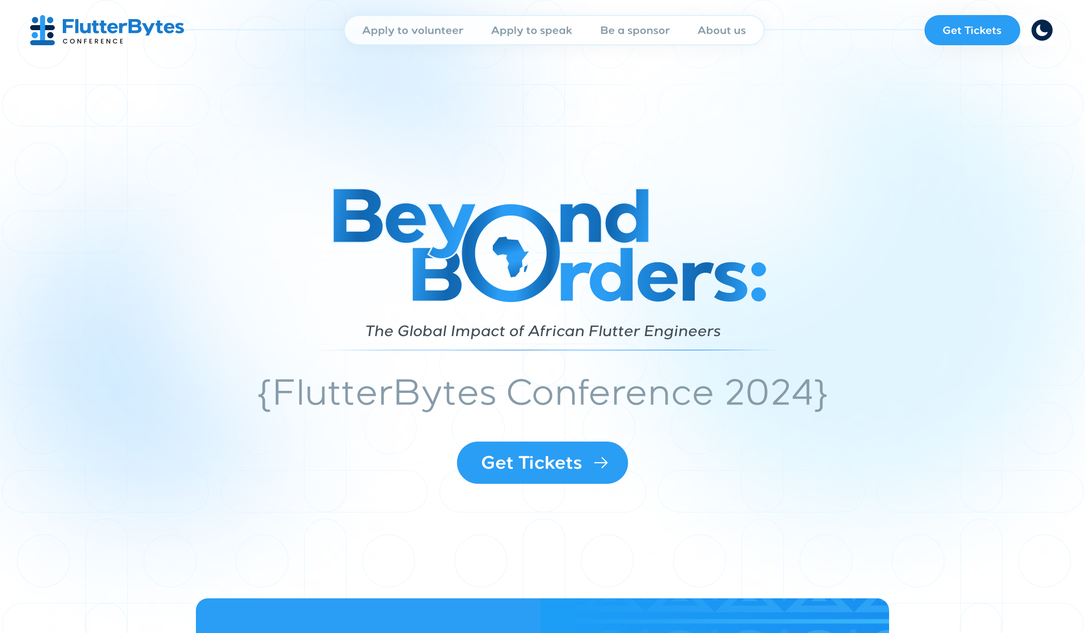
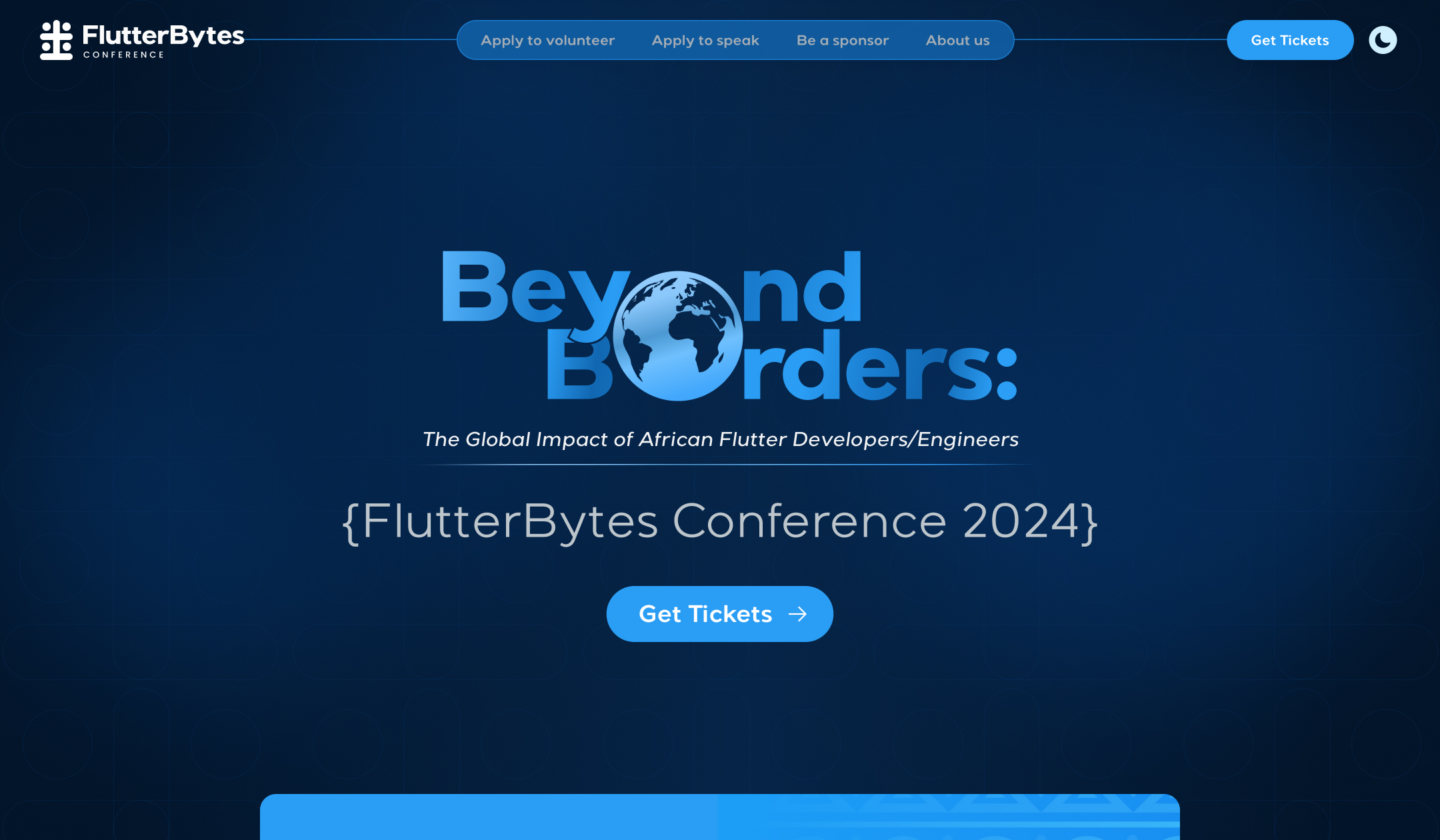
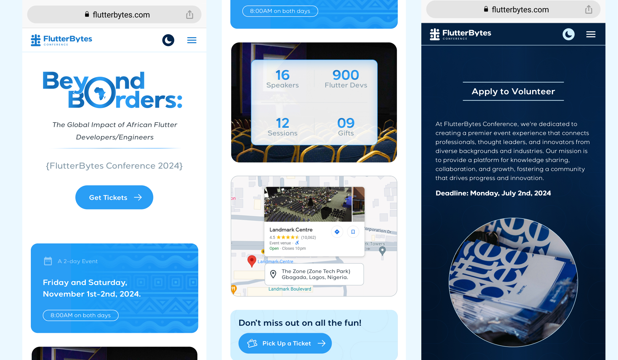
The theme of the conference for 2024 is "Beyond Borders: The Global Impact of African Flutter Engineers". That's why the hero section is based off the theme. This happened after we had initially worked on a different hero section where the main content was "FlutterBytes Conference 2024" and not the theme of the event. The other designer recommended that we make the theme the main part of the hero section and then we tried it and it came out much more better. I'm grateful we did that iteration.
After agreeing to the iteration, I thought to turn it up a bit with an event theme design using "Beyond Borders" majorly. Thus, I created the animation on the hero section which shows how FlutterBytes Conference is going beyond borders from Africa to the whole globe. I also enjoyed creating the animation to complement the UI design and convey the idea better. I am even more proud to say the animation was done entirely in Figma.
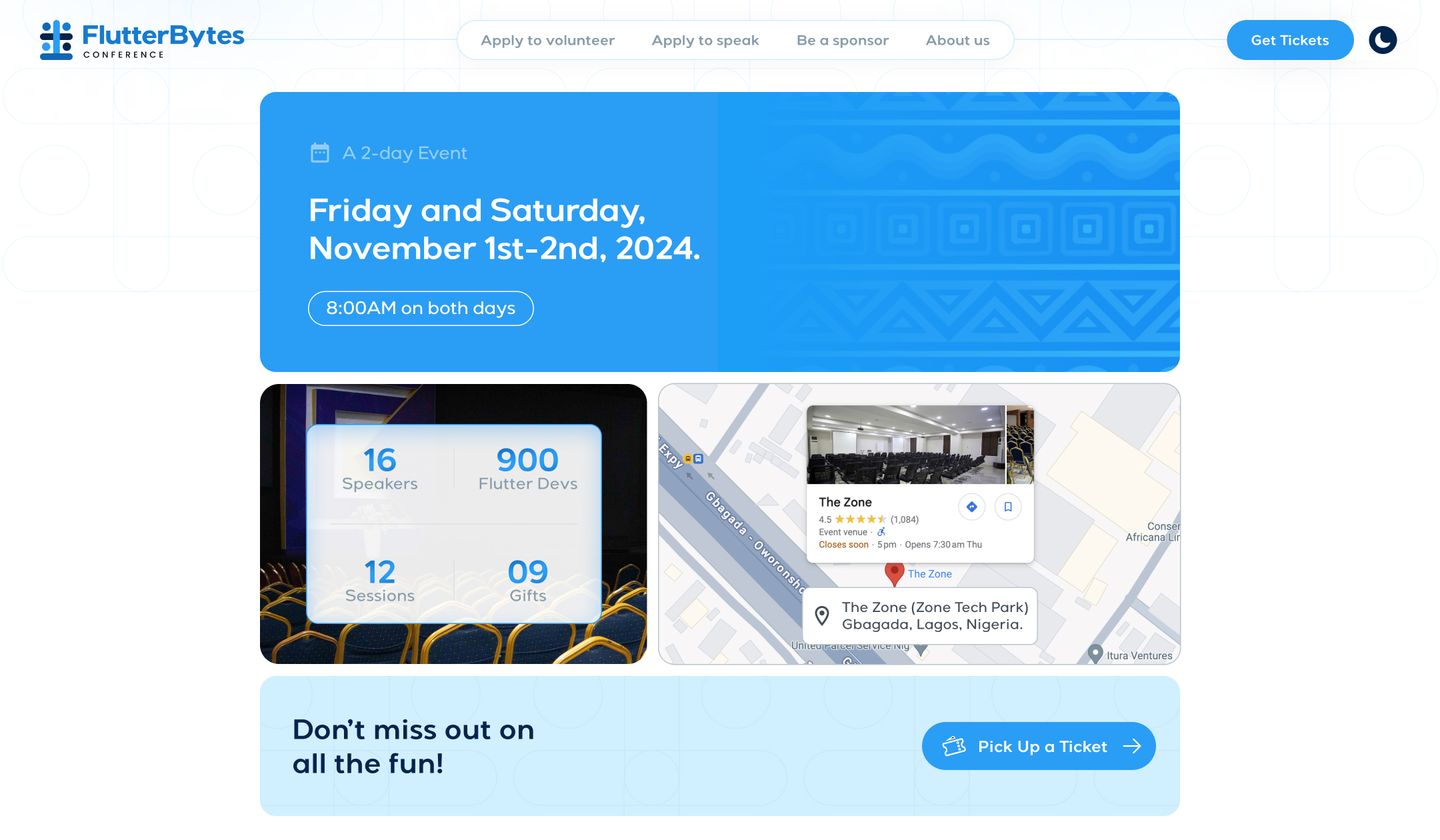
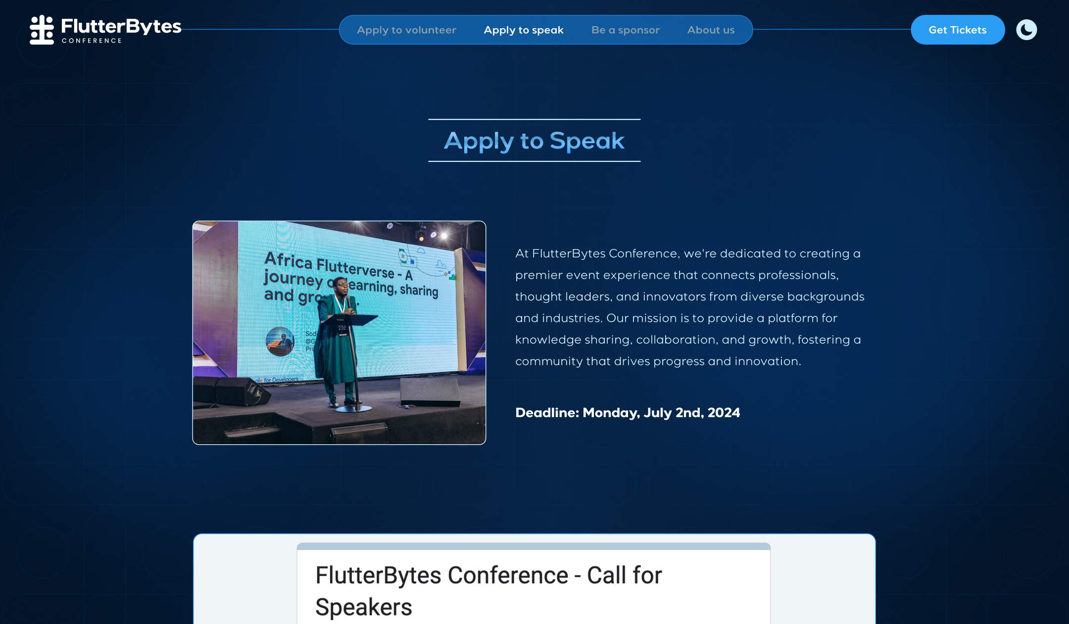
So, here are a few screens below to show the work done. Simply visit the live website to see it all.
Year
2024
My contribution
Lead Designer
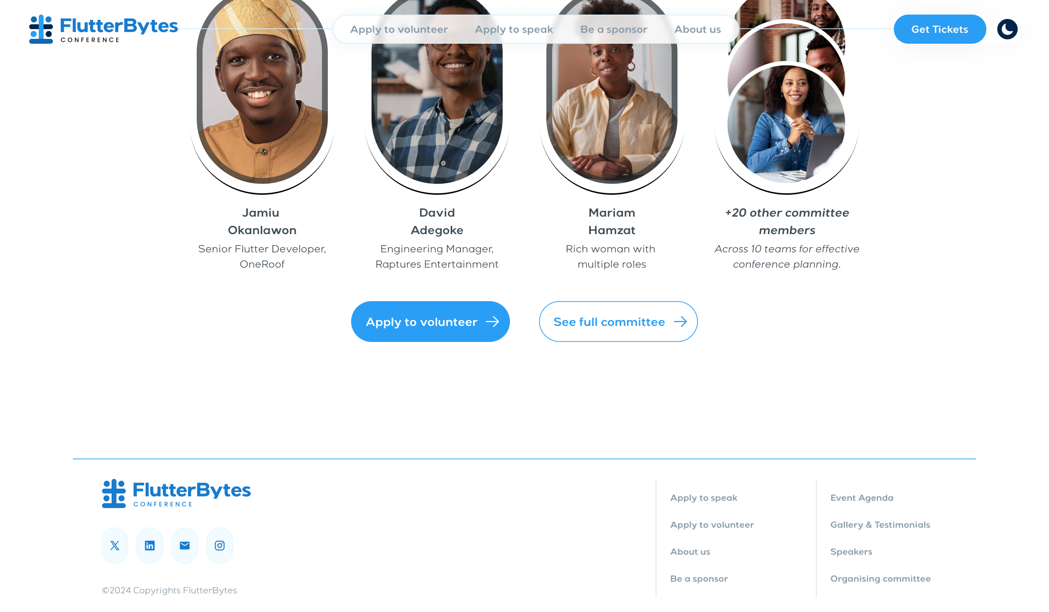
The team
1 Project Manager 3 Developers 2 Designers

After the screens
After designing the screens, the animation almost had to be removed because of the implementation but eventually, myself and the lead developer on the project worked closely to make it happen till it happened. I simply exported the animation as a gif and handed it off to the devs to make the implementation smoother.
Also, the direction was to keep it simple, minimal and clean similar to the coming soon website and other designs for the community. I'm glad we were able to achieve this even starting with the navbar which didn't need to take up the whole horizontal length.
One other thing that I was concerned about was the responsiveness of the website as in how things would look on smaller screens. Eventually, it wasn't an issue since we provided the mobile version of the designs and worked closely with the devs too. Overall, it was a bit tight and demanding but it was enjoyed. I'm glad the result is lovely.